The Bell is a traditional English pub in Sussex, it was in a run down state and needed bringing up to date by it's new owners, property developers Cathedral Group.
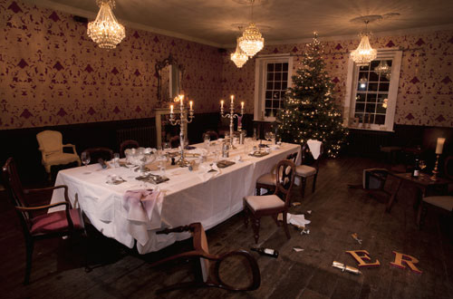
Whist retaining the qualities and values of a good old British local, Cathedral wanted to turn the pub into something more. A destination that is different, memorable and would be talked about. They already own a chain of hotels but realised the trend towards boutique and quirky retreats was a growing one.
Whist retaining the qualities and values of a good old British local, Cathedral wanted to turn the pub into something more. A destination that is different, memorable and would be talked about. They already own a chain of hotels but realised the trend towards boutique and quirky retreats was a growing one.

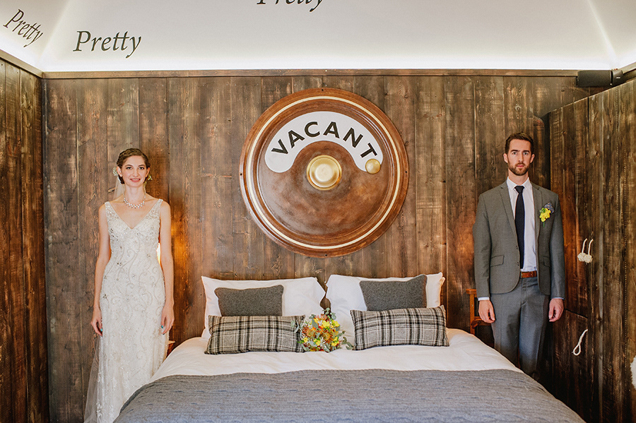

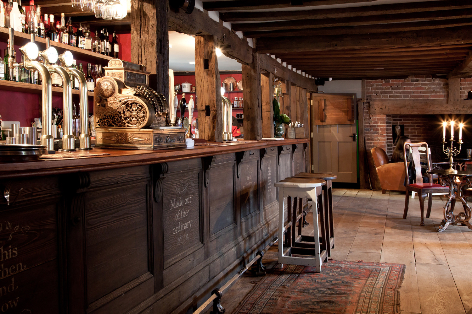
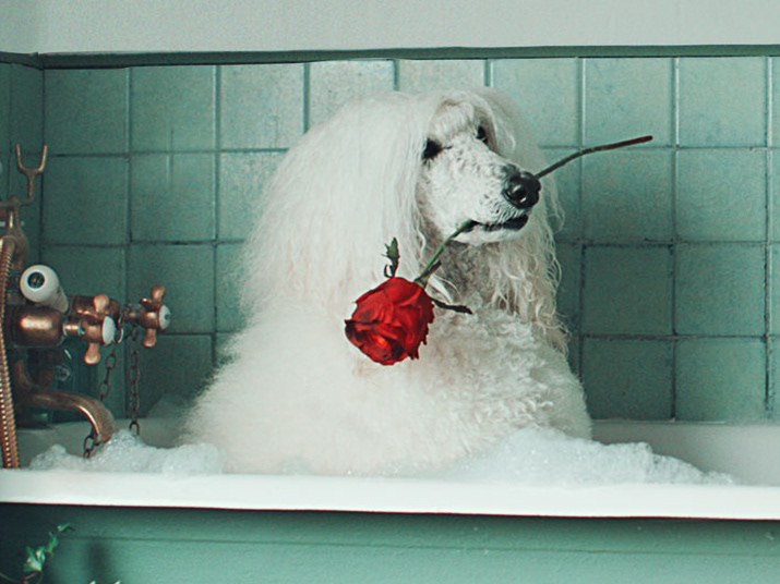
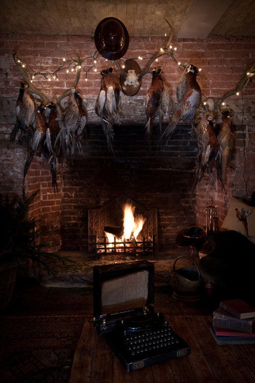
The interior of the old building was restored to it's original beauty and embellished further. In the gents toilets there are no urinals, just French horns. The guest rooms hide many fun secrets that are there to be discovered. In the rear courtyard a beautiful set of individually themed wooden lodges have been built with a circular nest building, all envisioned and designed by We Like Today.
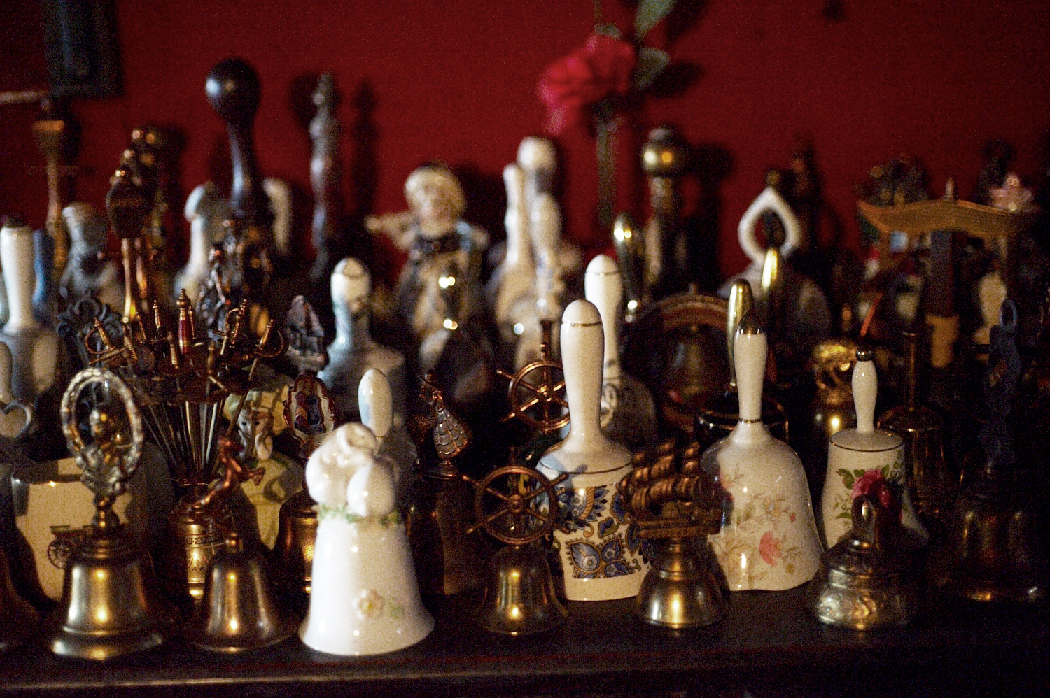
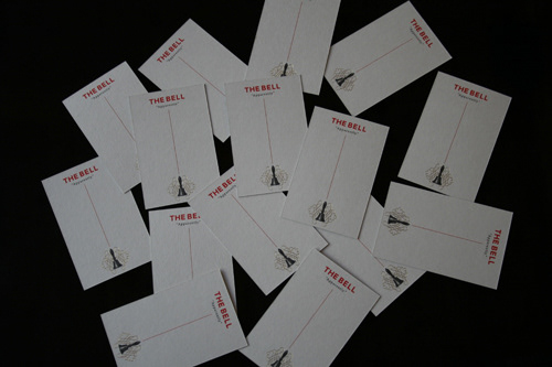
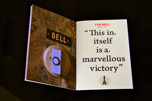
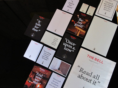
The visual identity of the pub uses an old bell which was part of a collection that the previous landlady had amassed over the years. These trinkets were originally documented before the renovation by photographer Richard Learoyd. He also photographed the rest of the old building and it's contents which were used across the marketing to tell The Bell's story.
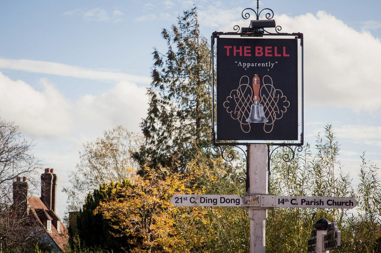
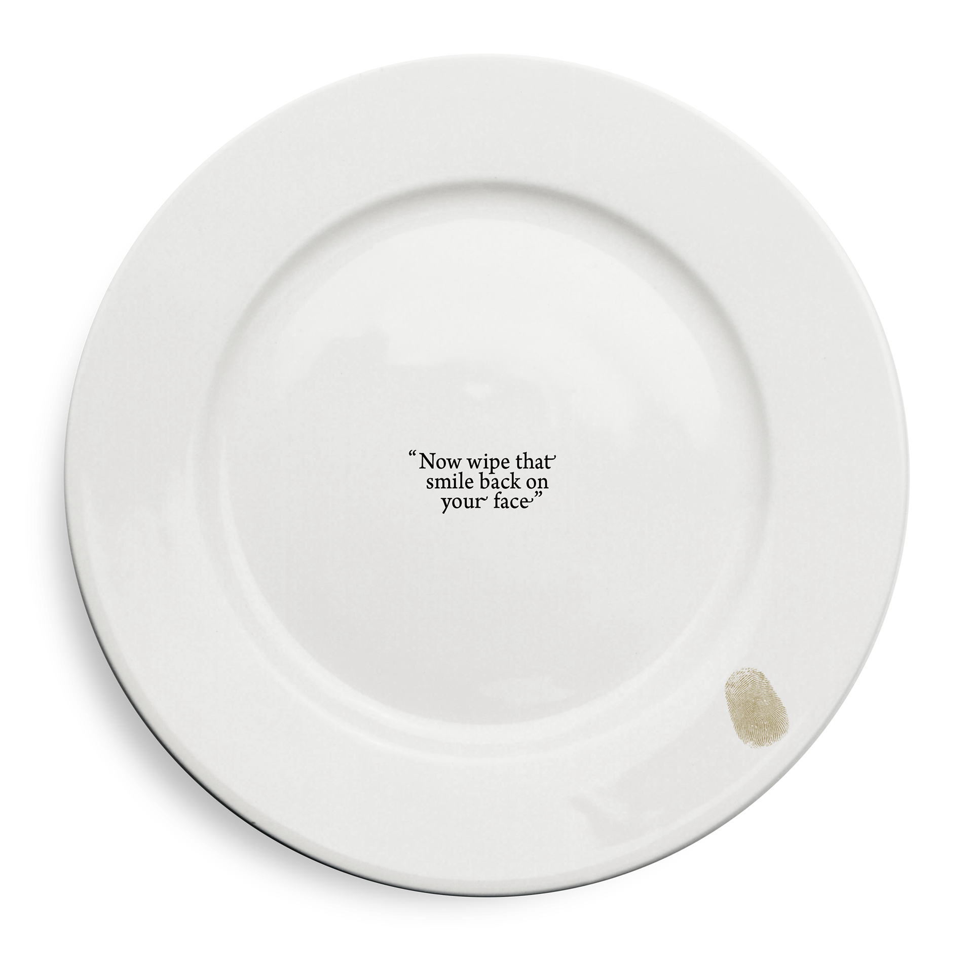
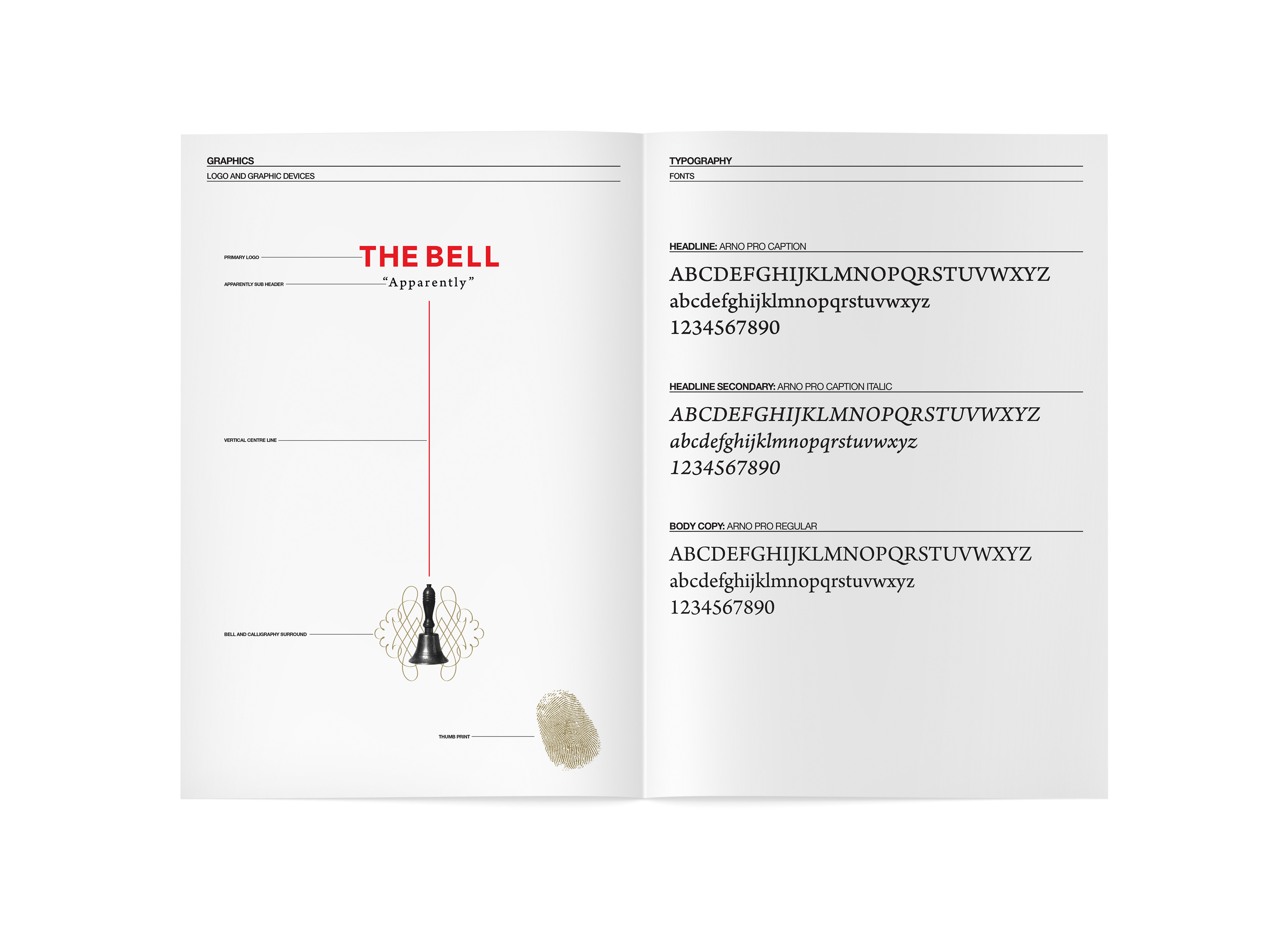
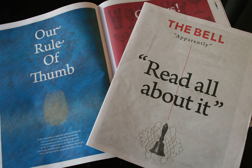
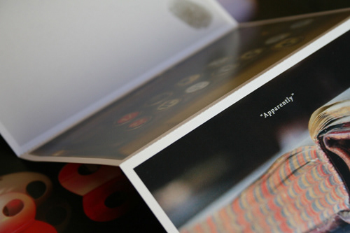
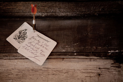
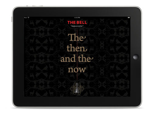
The 'Apparently' tag line which appears throughout the campaign was seen as a typical pub conversation starter and adds a level of further intrigue, Apparently.
The visual identity of the pub uses an old bell which was part of a collection that the previous landlady had amassed over the years. These trinkets were originally documented before the renovation by photographer Richard Learoyd. He also photographed the rest of the old building and it's contents which were used across the marketing to tell The Bell's story.
The 'Apparently' tag line which appears throughout the campaign was seen as a typical pub conversation starter and adds a level of further intrigue, Apparently.


Client: Cathedral Group Agency: We Like Today Creative Direction: Richard Brett
Graphic Design and Art Direction: Myself
Graphic Design and Art Direction: Myself